Stuart Davis was an early American modernist abstract painter. He was well known for his jazz-influenced, proto-pop art paintings of the 1940s and 1950s, and his loud and colorful painting in the latter years of the 20th century. Stuart Davis’s art paintings were based off of his love for jazz music. He listened to “hot” jazz and used the blues and marching bands style as inspiration for his paintings.
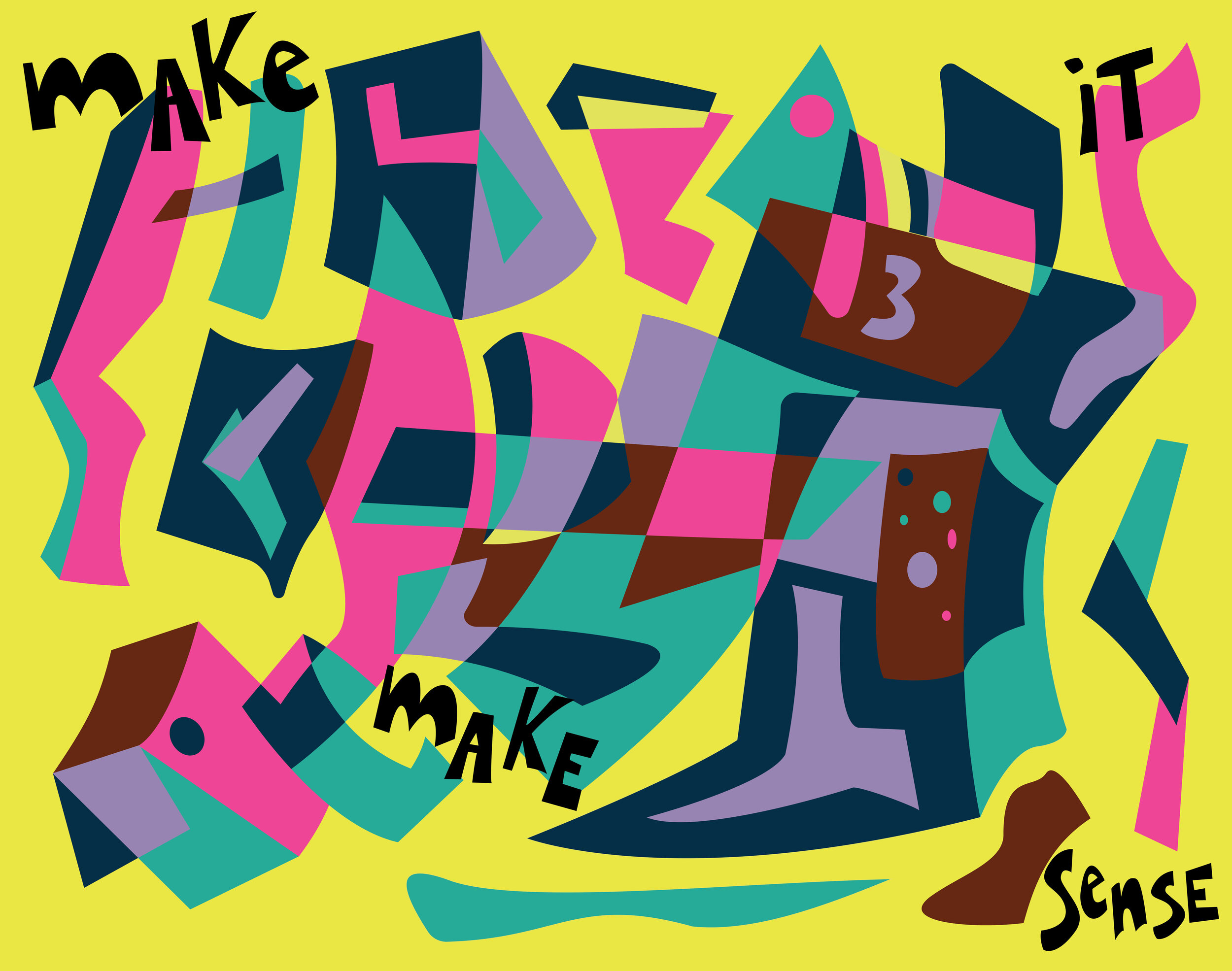
Clarity
Clarity was more so a personal painting, something everyone can relate to in their life. It was a confusing part of my school career where the teachers were sometimes a little contradicting whenever they make a statement about something. A common phrase in the classes was “Make It Make Sense”, which is scattered across the painting. The colors are jarring but somewhat meshing well together. For Stuart Davis’ paintings, his disorganized elements and colors always have a sense of order in them.
Salecram
This is a self-representation of myself. I decided to mimic another one of Davis’ illustrations called “Visa”. Salecram is my name spelled backward. The reason why I gave this illustration that title is because I believe that there is a version of me that is completely opposite of who I am or that this is what I want to become over time. The colors I used are all complements of each other in each sort of way, which plays with the title of this illustration. The text “Marcy” is a teenage nickname that was given to me in high school and I decided to keep the name in the middle because most people call me that. “Dubie” is a nickname that was given by my little brother when we were younger. This is one of my favorite illustrations out of the ten. I mimicked Davis’ Visa almost perfectly with the composition, but I did decide-since I wanted this to be a self-representation- to change the colors.


Barbershop
I based this illustration on my local barbershop. This illustration is based on the colors that I see when I go there. The three coils represent one of the tools used at the barbershop for cutting hair. The tiles represent the floor. The number 15 is the cost of my haircut. And the phrase “Nugs, not drugs” is a poster that always catches my eye every time I walk in there. I really like this illustration because it’s more of a personal illustration like some of my others. I think it’s my 10-Year Anniversary of attending the barbershop.
Insomnia
The text above “Dream” is a command that tells the viewer to go to sleep and “dream” through the illustration and as the viewer is “dreaming”, there’s another abrupt text that reads “Wake Up”. The reason for adding these two commands is because insomnia is habitual sleeplessness and inability to sleep. Just when you are about to fall asleep and dream, you’re awakened and can no longer fall back asleep. The colors for this illustration are the known colors that are not compatible with the best sleeping, each color having its own different meaning. Stuart Davis’ painting, “Owh! In San Pao!” was the reference for this illustration.


